Creativity is the thing which is not given to many people. Very few persons are gifted with art and creativity. The designing field has flourished to a great extent in recent times. Website designing, logo designing, and many other designing fields are the backbone of the marketing strategy of the organization and business. But many times, the marketing techniques of the companies fail due to which the companies suffer a heavy loss.
The logo is an important element of the marketing area of the company. The logos of the company fail due to many reasons such as improper design and colors. There were some of the logos of popular companies which were the worst failures. We have listed our Top 10 Worst Logo Fails Ever.
10. Logo of the Catholic Church’s Archdiocesan Youth Commission
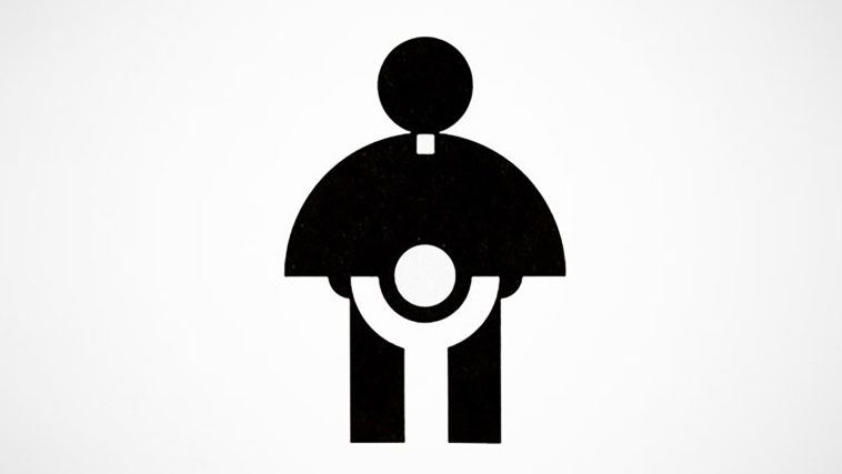
This is one of the worst logos which failed. The logo was made in the year 1973 and it also achieved the award from the Art Directors Club of Los Angeles.
But the logo was not liked by the people due to the unusual design and common colors used. This logo was not in any way attention-grabbing one and no one could very judge the message behind it.
9. A-Style Logo

A-Style Logo didn’t succeed in the market due to the weird design and color. The logo is to represent the clothing company but it didn’t work well among the customers. The letter A is shown with two circles that look awful and dirty to show the clothing line.
A-Style Logo looks like the persons who are falling on the ground. The yellow background with black colored letters didn’t fit well with the actual message of the logo.
8. Pepsi
Pepsi is one of the popular drinks in the world. The company has changed its logo many times before. The first logo of Pepsi was a fat guy with a big belly and holding Pepsi but it didn’t make public. So, the company decided to change the logo to circular one with red, white and black colors for representing Pepsi Max.
But that also didn’t succeed. The two consecutive logo failures incurred a heavy loss to the company. Finally, the company adopted the logo with red, blue and white colors on it.
7. Computer Doctors

The logos of Computer Doctors created many misrepresentations in the minds of people. The logo of the company has a computer mouse actually which was taken in the wrong sense by many people. The letter U is shown with the help of a mouse which has many meanings.
This logo was one of the most hilarious and weird logos of all time. The U looks like a mouse or some another small animal. This logo was described as something very awful.
6. Locum
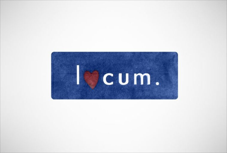
Locum is a company of Sweden which is involved in the tasks of property management and many other matters related to property. The logo of this company is not a professional logo in any sense. The logo has a heart shape to represent the letter O in the spelling of the locum.
The logo of this company was very funny and didn’t match the company. This logo, in fact, looks like a logo of some clothing company with a heart shape to show clothes. The logo failed to gain attraction among the customers.
5. Institute of Oriental Studies

This logo was one of the biggest failed logos of all time. The logo is totally different from the concept of the restaurant. Logos create various ideas in the minds of different people. To some, it may appear as a rising sun or some dirty thing.
It looks very unpleasant at glance and does not give a good impression of the institute. The bright colors used in the logo are actually not proper to show the logo of the studies institute.
4. Olympic Logo of London 2012
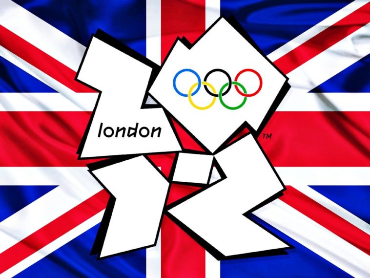
The Olympic logo of London in the year 2012 was made by Wolff Olins at a cost of $800,000. In spite of the heavy expenditure on the logo, it failed because of the contradictory ideas it shows. The logos didn’t have any popular places in London.
There were no landmarks used to represent the city of London in any way. The logo didn’t have a perfect combination of different parts. The idea of the Olympic Games is not represented properly. The logo has many sharp points and objects used in it which does not attract the people. The color used is also not good.
3. Arlington Pediatric Center

This logo was described as one of the worst logos of all time. The logos create a very bad impression in the minds of the people who see it. Arlington Pediatric Center is a pedophilic center and now it has changed its logo to something good.
But the second logo also didn’t do well among the people. This center has changed many logos over the years but didn’t succeed in the market. Probably, the marketing strategy of the company is not proper.
2. Office of Government Commerce

This is one of the worst logos ever created. The Office of Government Commerce in the office of treasury. The logo is not professional in any way. The logo used is very informal and does not create the idea of the government office in the minds of the people.
It is a very simple logo with no stylish words or designs. There are no colors used in the logo which makes it very boring to see it. This is one of the weirdest logos ever made.
1. Mon-Sat Logo
The worst logo made ever is that of a Mon-Sat Logo. Even a stupid person can tell that it totally a dirty logo generating unpleasant ideas. The company needs to improve its marketing strategy to create some decent and nice logos. Mon-Sat Logo is the biggest mistake of marketing by the company giving a bad impression of the concern.
The success of logos depends on the creativity of the marketing department. The failure in marketing techniques will not only result in the loss of the company but also spoils its reputation in the market.
Top 10 Worst Logo Fails Ever
1. Mon-Sat Logo
2. Office of Government Commerce
3. Arlington Pediatric Center
4. Olympic Logo of London 2012
5. Institute of Oriental Studies
6. Locum
7. Computer Doctors
8. Pepsi
9. A-Style Logo
10. Logo of the Catholic Church’s Archdiocesan Youth Commission


